Liquid Alchemist
For a few years, I worked with the U.S. cocktail syrup brand, Liquid Alchemist, refining their brand as the company continued to expand. I approached them in late 2023 about updating their product labels to better reflect their evolved brand identity. Early 2024 was great timing, as they were poised for national distribution expansion, and they jumped on board! I was really excited, because I know what this product line could become and I also knew the brand wasn’t taking full advantage of their unique visual identity that was quickly approaching ‘cult brand’ status.
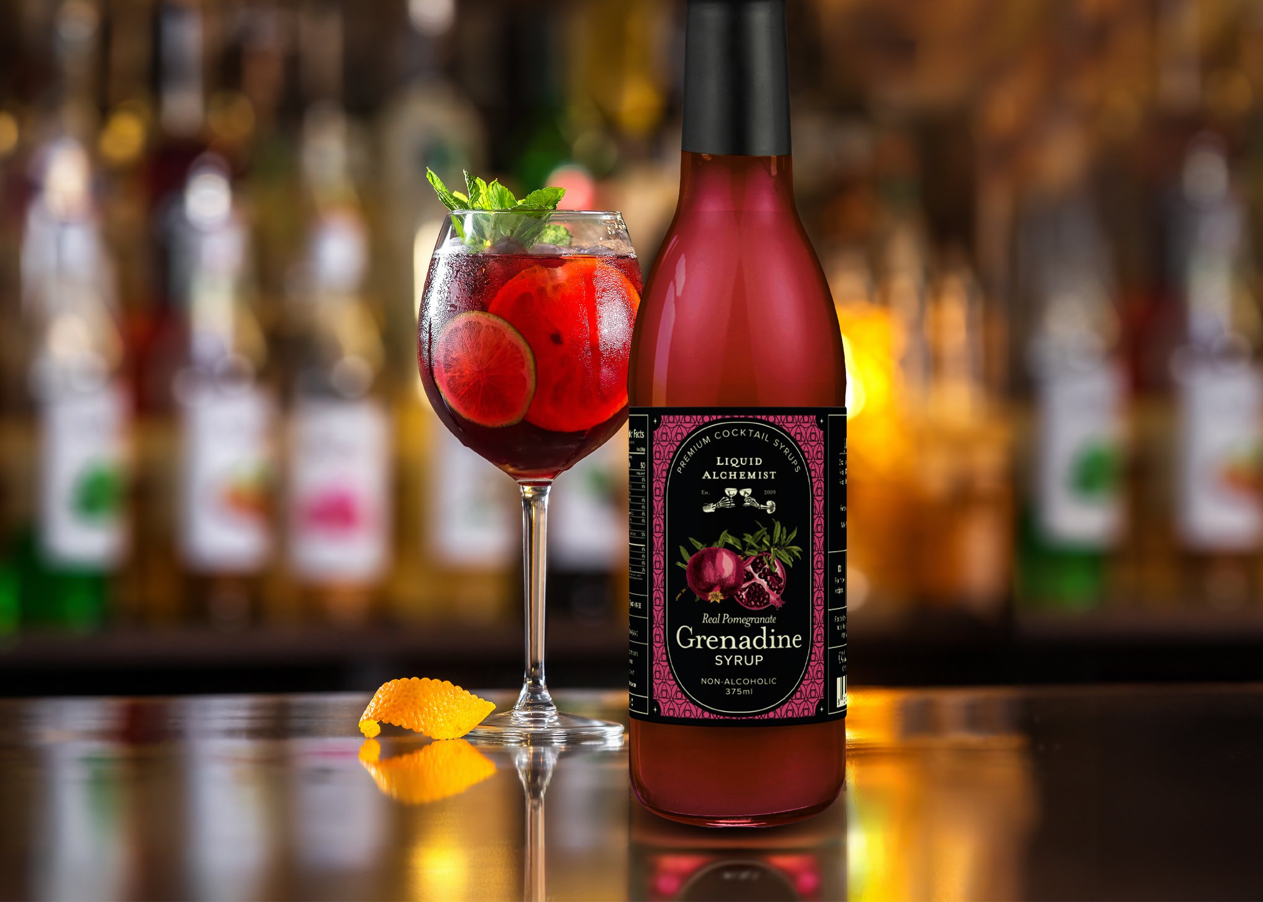
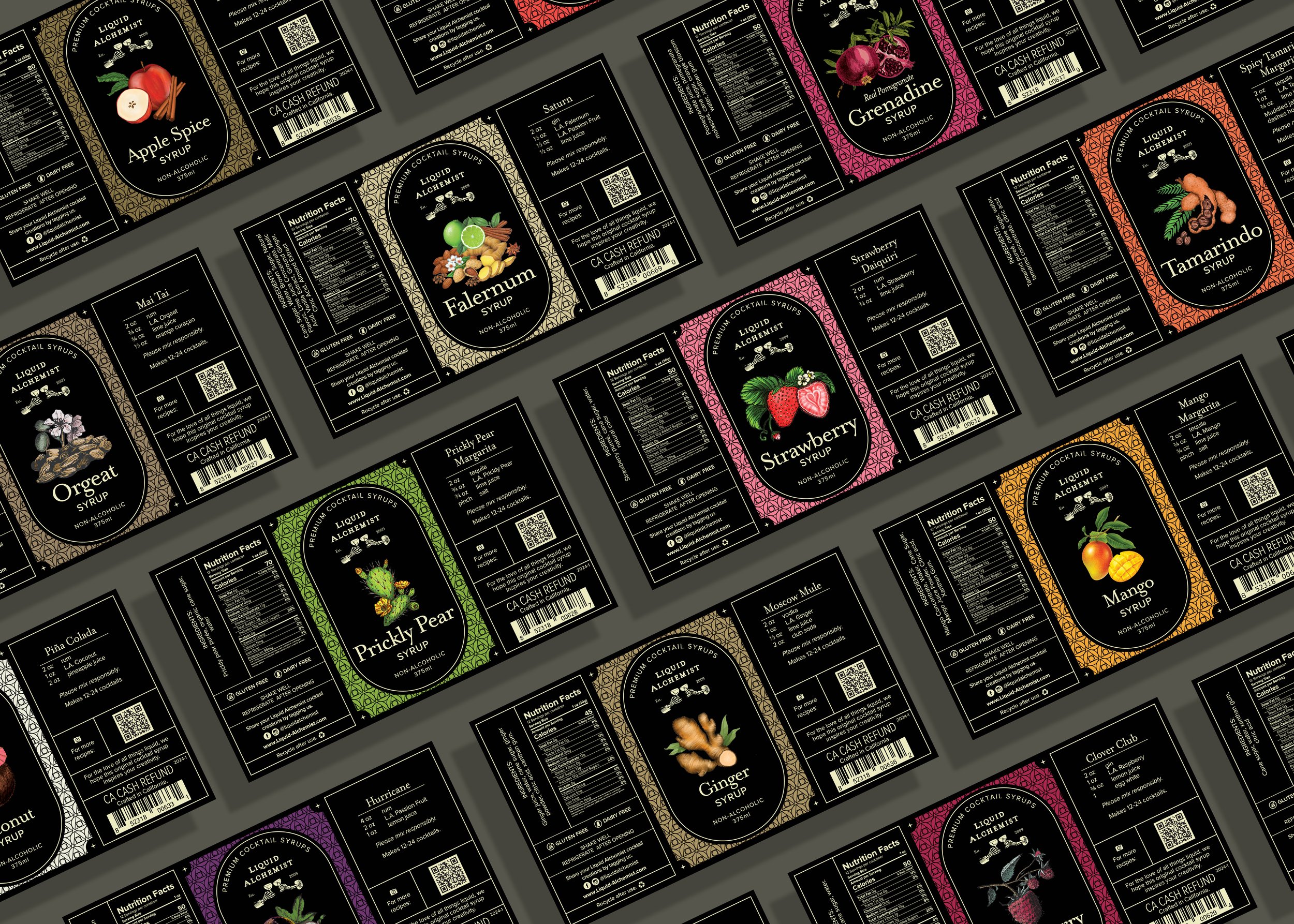
Additional goals for this redesign were to create labels that maintained the brand's original essence while elevating its appeal to new markets and exuding premium quality. After thorough color exploration, we chose a black label to embody the brand's rebellious and dark aesthetic. The label color actually worked to our advantage, because none of the Liquid Alchemist industry competitors were using black, which meant we would certainly stand out on the shelf. We cleaned up our type, and kept our decorative serif font to a minimum when design and legibility allowed, and a clean san-serif when it did not. As a nod to the original labels, we kept the iconic, front-panel oval that Liquid Alchemist labels have been known for, as well as a subtle use of the popular brand pattern. These key choices ensured that loyal customers would still recognize and connect with the product.
Our resulting label is sophisticated, meticulously aligned with the brand's identity, distinctly original on the shelf and online, and exudes premium quality.


