
Sunwink™
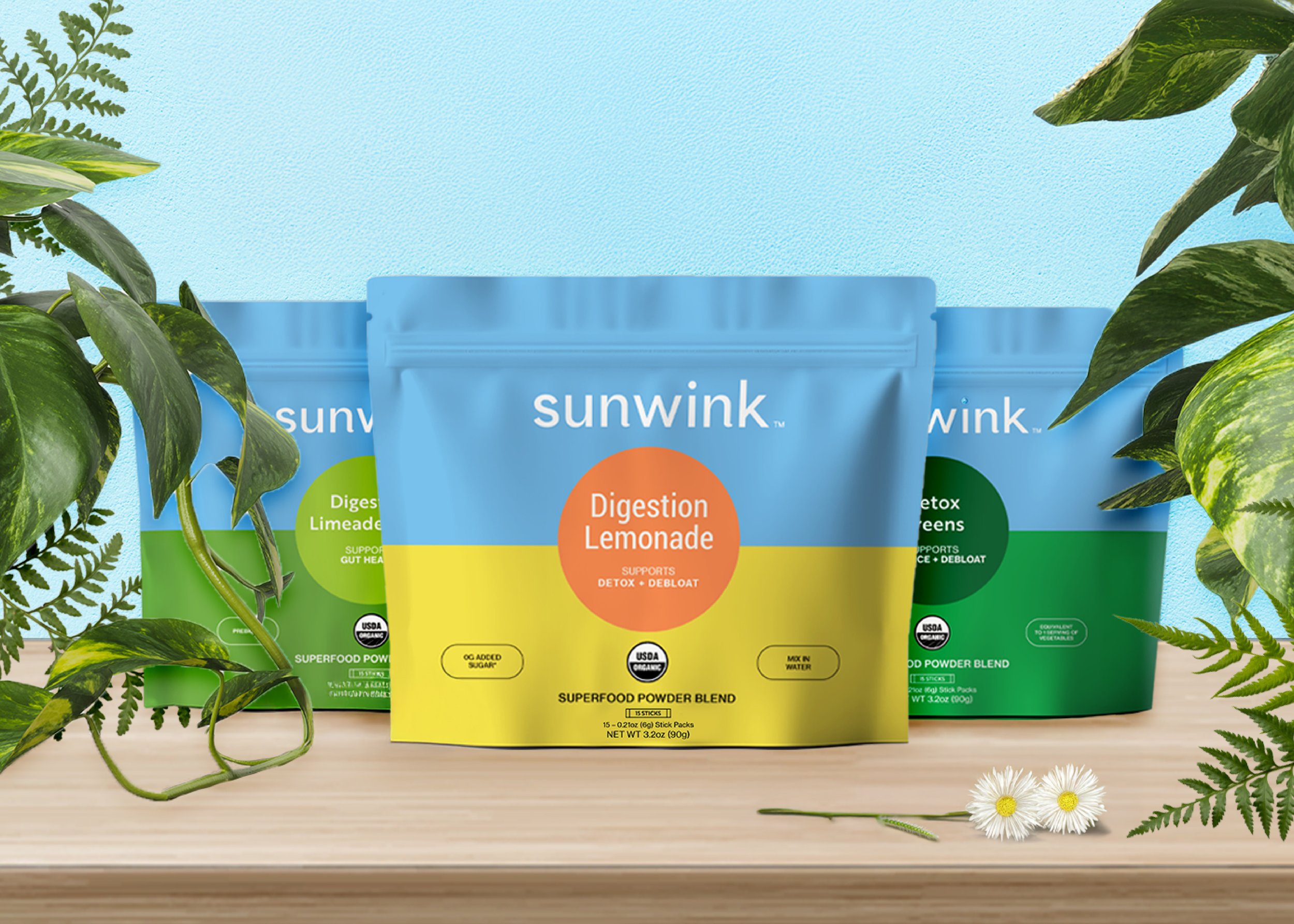
When a client approached me about a newly acquired hydration wellness brand, I knew we had an exciting challenge ahead. The brand was undergoing a major transformation—reformulating its recipes, shifting from tall canisters to single-serve sachet pouches, and refining its positioning for a fresh market segment. Unlike many packaging projects I’ve tackled, this one didn’t start with a blank slate or a design clearly needing refinement. The existing packaging was already a visual standout—clean, vibrant, and modern, with an eye-catching shade of blue rarely seen in the wellness or beverage space. The typography was elegant, and the product callouts were smart and well-placed.
But there was a problem. Consumer testing revealed that the current design wasn’t resonating with male audiences—a crucial segment for the brand’s sustainability and growth. My goal was clear: retain the integrity of the beautiful packaging while subtly adjusting it to appeal to a broader, more inclusive audience.
Through an in-depth analysis, it became apparent that the color and typography choices leaned slightly feminine. Under certain lighting, the striking blue took on a periwinkle hue, and the delicate serif font used for the product name lacked the strength and presence we needed.
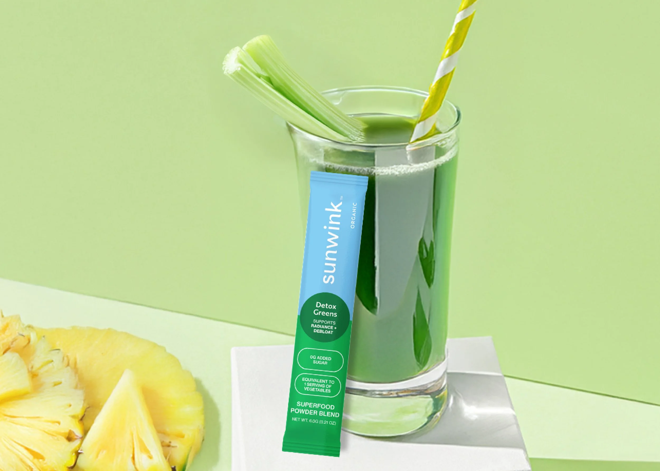
The first step was structural: transitioning the canister design to double-sided stand-up pouches, integrating the new recipe callouts, updated nutrition facts, and ingredient lists. We had more real estate to fill with our new format, and it took a bit of refinement to get the perfect balance. From there, we distilled the design further for the single-serve sachets housed within the pouches, ensuring clarity and consistency on such small pouches.
Next came the color story. We explored various shades of blue, considering deeper hues and cooler tones, but in the end, the original vibrant blue proved to be the perfect balance—light and energetic enough to align with the brand’s wellness-forward positioning, yet confident enough to engage a more diverse customer base.
Then, I took a deep dive into typography. The serif font was swapped for a range of masculine-leaning sans serifs, tested rigorously against the existing branding and new packaging formats. The winning choice? Brother 1814—a bold, modern font with just the right amount of structure and versatility to complement the brand’s aesthetic while reinforcing a sense of strength and reliability.
Beyond visual refinements, product names and descriptors were streamlined for greater clarity and impact. Every design decision was made with both the consumer and the retail shelf in mind—ensuring the refreshed packaging not only looked beautiful but also performed in-market.
This project was a great reminder that effective package design isn’t always about reinventing the wheel—it’s about strategic evolution. By respecting what worked while making precise, intentional adjustments, I was able to deliver a packaging refresh that strengthened the brand’s presence and widened its appeal. In the world of wellness, where design must effortlessly communicate function and trust, this packaging refresh was a masterclass in how small tweaks can make a huge impact.